How readers care: picture-book illustration & the science of ‘seeing’.
What does science have to do with picture-book illustration? Quite a lot, as you will see …
To explain, I thought I would share with you an edited version of the preamble to my portfolio course, “The Humble Horizon”. It may help explain the reasons behind my obsession with illustrated background, with trees and with shadows.
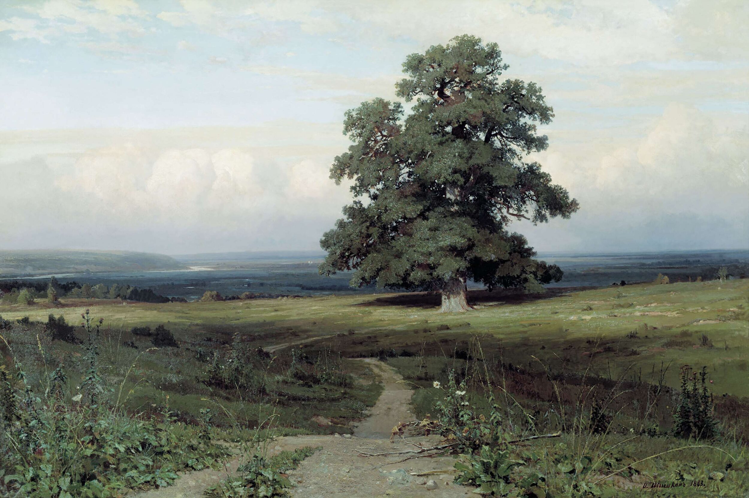
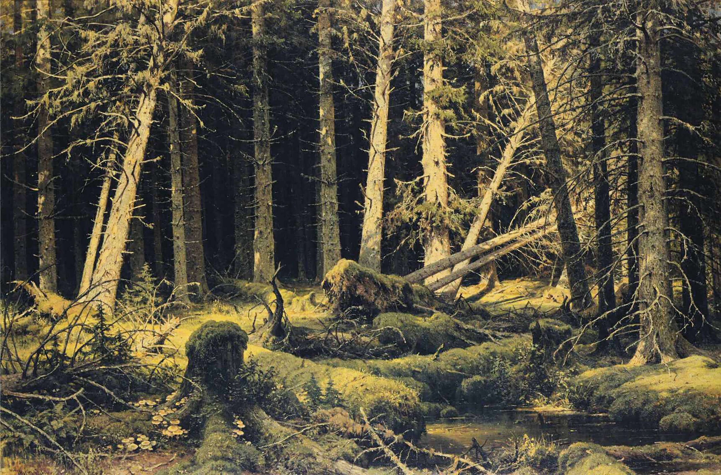
To prime your own brain for what follows, have a look at the paintings below by Russian Poetic Realist Ivan Shishkin. On the right is Wind Fallen Trees, !888. On the left, Among the Open Valley, 1883. One painting offer us a broad open horizon, the other offers no horizon at all.
I invite you to gaze a moment at each, suspend analysis, sink into the deep recesses of your brain and feel the different effects of the two. Feel the effects in your brain, and feel them in your body. (Once you have experienced this, you will probably have no real reason to keep reading …)
Helping the viewer of picture-book illustrations to care
It goes without saying there is no point making marks on paper that a viewer is not biologically capable of caring about.
But how do we know what makes viewers care? We all have different experiences, cultures, pasts … so we care about different things.
This is where science comes in handy. Science helps us think about the arts in a new way, and in a less (dare I say) preconceived way.
It is true we have different memories, preconceptions, likes and dislikes. But these things take up only a small part of our cognition. A huge amount of seeing, thinking and feeling goes on below our conscious minds, and is registered, processed and sorted by our hard-wired and hardworking neurons before our memories, opinions and prejudices kick in. It is this early, primary part of our seeing process that underlies how and why we ‘care’.
Understanding why we see what we see, and how we respond to what we see, is understanding why we care about what we see. And having some understanding of this can provide us with the tools for triggering relevant narrative responses in our readers.

Viking Borre-style (I think) woodcarving. We are hopelessly attracted to pattern, and even more susceptible to disruptions in pattern.
“The job of the artist is … to capture attention … by [re]producing those elements that most vividly capture attention in the real world”
Professor Boyd doesn’t mean illustrators should be photorealists. He means that the job of the illustrator is to underpin illustrations with those visual elements that most attract our seeing brains.
These elements are things like pattern, repetition, contrast, light, proportion, and scale, and have nothing to do with concept, content, schema, style or culture.
These visual elements are the things that can be manipulated to trigger story-relevant responses.
Creating an illustration using these foundational building blocks is what will engage readers to feel the story: to experience it with their bodies, to literally set their nerves tingling, their hormones cascading, their heartbeats accelerating.
Illustrating setting
Some of our most powerful primal emotions relate to our surroundings, to our environment, to the settings within which we live our lives.
Setting is EVERYTHING that exists beyond our own bodies. Setting begins where our skin ends. It includes built environments of houses, streets, walls, rooms, rooftops, gardens, parks, and natural environments of forest, underwater, clouds, desert and any other geographical landscape you can think of.
We are always surrounded, irrevocably, by where we are.
We cannot escape from where we are.
We are always somewhere.
What is more, we are not separate from where we are. We are a PART of where we are.
We stand in it, we breathe it in, we hear it, we smell it, we touch it and we eat it.
Most importantly, we respond to where we are … emotionally.
We respond emotionally because the sensations picked up by our five senses, and the messages our senses send to our awareness, are filtered through the emotion centres in our brains.
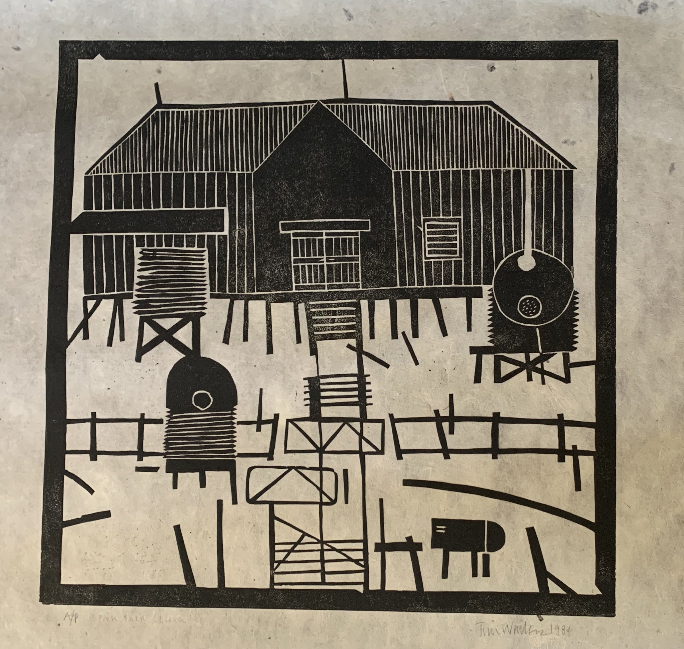
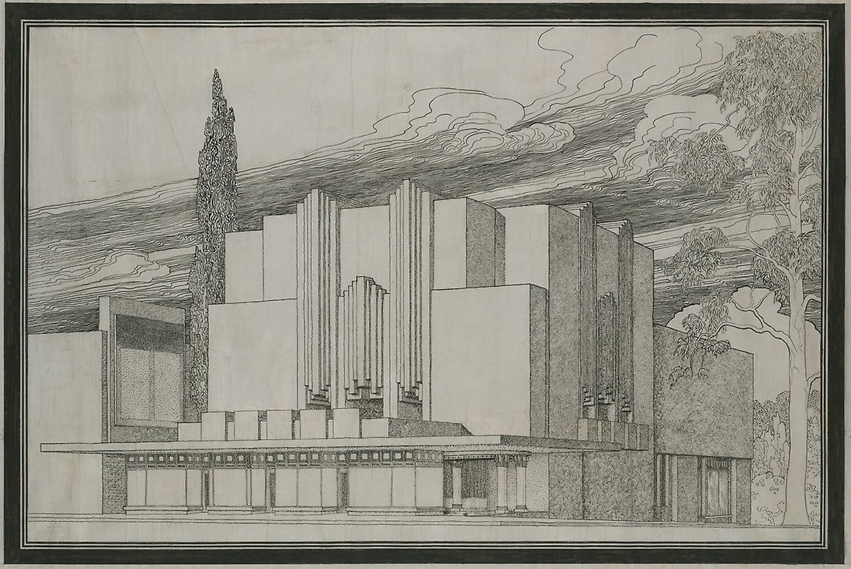
Images above: two dramatically different approaches to drawing built environments, by architects working more than half a century apart. On the left, a Tim Winters lino print “The Pink Shed”. On the right, Walter Burley Griffin’s drawing for the Ascot Theatre, Melbourne. Each offers us a unique ‘feeling’ about the environment, or setting, they are depicting.

Lane Smith illustration for BIG PLANS by Bob Shea.
Background is not just something to fill in the blank space.
Background is not just a visual list of concepts.
Background is impact and emotion.
Because of the way our brains function, a setting can be one of the most effective elements of a visual narrative, so long as we understand how best to depict it.
And the best way to depict narrative that has impact and emotion is to understand (at least a little) of the science of what our brains care about.
There are parts of our brains that work constantly to keep our surroundings under surveillance, whether we are aware of it or not. Our subconscious minds are perpetually on the lookout for safety or danger, opportunity or threat, and are forever on the alert to spur us into action of one kind or another.

Anne Herbauts La Princesse au Petit Poids
In the contemporary world, we no longer care too much about sabre-toothed tiger-attacks or marauding mastodons, but we do continue to be on the alert for passing cars, lurking sharks, errant cricket balls, friendly dogs, protective bees, rampant viruses, roiling clouds and (in the Australian springtime) diving magpies.
We are constantly on the alert for everything and anything that is moving - AND for anything and everything that is NOT moving - in an unexpected way.
That is, we are forever on the alert for change.
We can grab reader attention by manipulating elements of line, direction, pattern, placement, contrast and light to suggest change.